More than 6 essential mouseover effects for the block editor
Know how to add mouseover effects such as zoom, ease in-out, font-size and others, when mouse hovering a block on WordPress using Mr.Utils…
Get mouseover options on the block editor
One of the cool features of Mr.Utils is the ability to easily install it as a WordPress plugin for free.
When you do so, an interface will appear on the block editor, allowing you to easily use the utility classes of this front-end toolkit.
One type of utility class is the mouse hover state, let’s focus on that for this post.
Note: If you prefer, you can install Mr.Utils without the interface and use the classes on each block Advanced section.
Animations
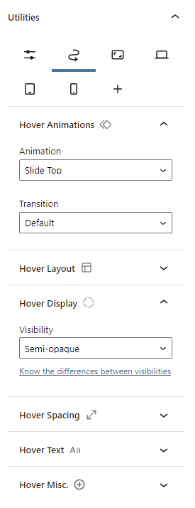
On the Animation section of the Hover tab (zigzag arrow icon) you will find options such as Fade, Slide, Scale and Zoom.
One thing to keep in mind when selecting one of those options is: By default, the animation will only occur when mouse hovering above the element, nothing will happen when mouse hovering outside the element… If you want the animation to rollback when you go outside the element, you must go to the Animation section of the Global tab (first tab) and select the transition type (e.g. Ease In Out).
Once you apply a transition globally, the animation will react to both hover situations.
Live example using Zoom animation
This paragraph block animates on mouseover!
Layout change
On the Layout section of the Hover tab (zigzag arrow icon) you will find options to change the size (width) of a block.
If you want to change the initial size, simply go to the Layout section on the Global tab (first tab) and find the similar option.
By default, the size will change without any transition/animation. If you want the block to change the size smoothly, you must go to the Animation section of the Global tab and select the transition type (e.g. Ease In Out).
Live example of size change
Display changes
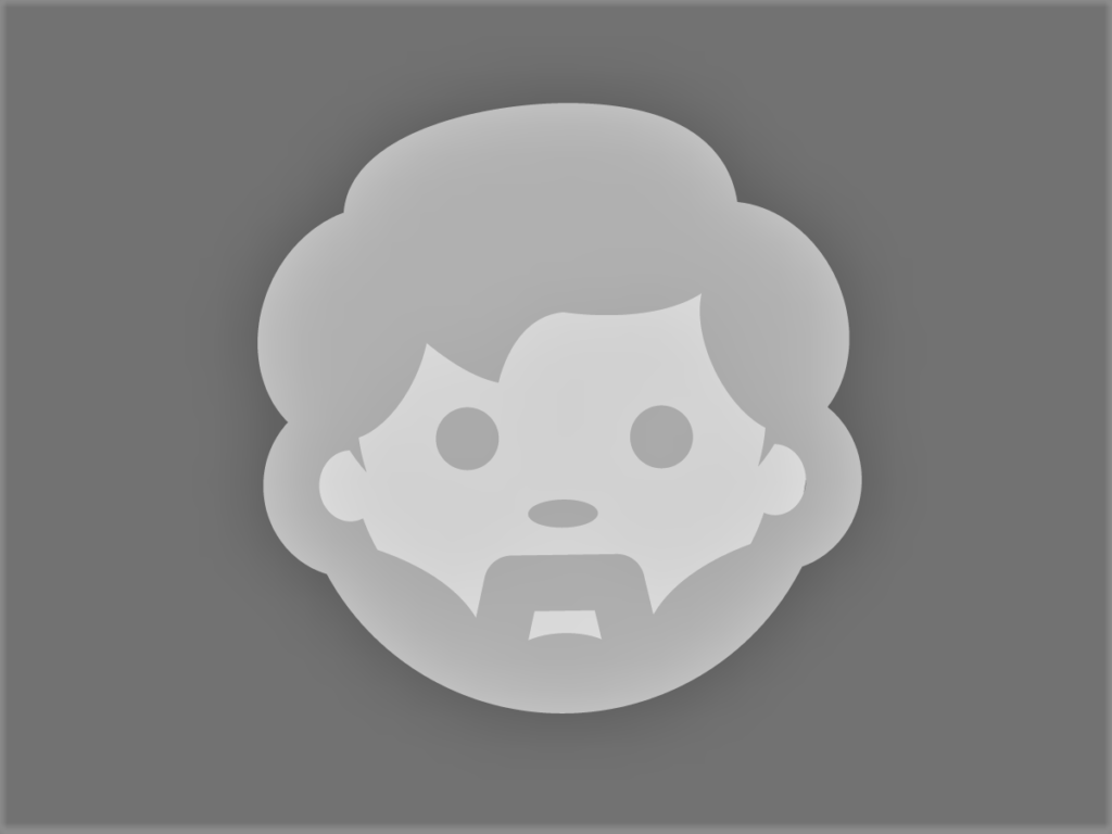
On the Display section of the Hover tab (zigzag arrow icon) you will find options to change the visibility type of a block.
Here you can better understand the differences between the visibility types.
With these options, you can make a block semi-opaque or totally opaque on mouseover. To do the latter, you must first put the block semi-opaque by default on the Display section of the Global tab (you can also use the option on the Desktop tab [screen icon]).
Just like changing the layout, if you want a smooth transition you must choose the transition type on the Animations section (e.g. Ease In Out).
Live example of visibility change
Spacing changes
On the Spacing section of the Hover tab (zigzag arrow icon) you will find options to change the spacing (paddings or/and margins) of a block.
Just like changing the layout or display, if you want a smooth transition you must choose the transition type on the Animations section (e.g. Ease In Out) of the Global tab (first tab).
Live example of paddings change

Text size change
On the Text section of the Hover tab (zigzag arrow icon) you will find options to change the font-size of a block.
Just like changing the layout, display or spacing, if you want a smooth transition you must choose the transition type on the Animations section (e.g. Ease In Out) of the Global tab (first tab).
Live example of font-size change
This paragraph block will have it’s font-size increased on mouseover!
Misc. Changes
On the Misc. section of the Hover tab (zigzag arrow icon) you will find some extra options such has:
Showing a scrollbar only when mouse hovering an element
There are more than 3 images below. Mouseover to see the scrollbar that will allow you to see all of them!
Those were very basic examples, but with some creativity you can use them to make fascinating and useful experiences for your website users 🙂
