Mr.Utils enhances the block editor with 8 extra features
On this post, I’ll guide you on how to use my front-end toolkit Mr.Utils, to scale and get features on the block editor of WordPress.
As explained on the previous post, a front-end toolkit might be the best future-proof and optimized solution to this site builder that is still growing.
Depending of your website and theme configuration, you might already be able to use the editor to change things such as the font-size, margins and paddings. But those changes would be made on each block individually, there’s currently at the moment of writing, no way to change those properties globally. Mr.Utils gives you a way to do that.
- 1 Installing Mr.Utils to use on the block editor
- 2 How to use Mr.Utils features on the block editor
- 2.1 Global font-sizes
- 2.2 Global colors (Mr.Dev.’s Framework)
- 2.3 Remove margins and paddings of blocks
- 2.4 Add global margins and paddings
- 2.5 Change visibility of a block depending of the device
- 2.6 Change how Columns blocks display on mobile
- 2.7 Change the order of blocks depending of the device
- 2.8 Horizontal scroll list of posts
- 3 Comments
Installing Mr.Utils to use on the block editor
On the documentation you’ll find a short and easy explanation on three methods to install Mr.Utils, by using Mr.Dev.’s Framework, by installing as a plugin or via manual installation. The most optimized method is using the framework because it allows you to select the type of utilities you want to use, combine and minify them.
Preview Mr.Utils changes on the block editor (Optional)
Because the block editor is a very visual editor that closely resembles the front-end, you might want to see the changes that Mr.Utils will apply to your blocks, before actually saving the post.
If you did the installation as a plugin you don’t need to do anything else and you can skip to “How to use Mr.Utils features on the block editor“.
Otherwise, you can configure it easily by using Mr.Dev.’s Framework, or manually if that’s your thing.
Preview changes using Mr.Dev.’s Framework
On the plugin settings on the configuration tab, you will find the CSS Utilities section. Check the box Utils Backend, and you are ready to go.
If you want to use utilities on breakpoints, simply select the ones you want on the same group of checkboxes.
Manually configuration of the preview
Add the below code into the functions.php file or into a custom plugin.
add_action( 'admin_enqueue_scripts', 'mrutils_admin_styles' );
function mrutils_admin_styles() {
    wp_enqueue_style( 'mrutils_admin', 'https://raw.githubusercontent.com/marcosrego-web/mr-utils/master/css/utils.css', false, '1.0.0' );
    wp_enqueue_style( 'mrutils_admin_backend', 'https://raw.githubusercontent.com/marcosrego-web/mr-utils/master/css/utils_backend.css', false, '1.0.0' );
}
If you want to add breakpoints you need to add more “wp_enqueue_style” to the above, between the first and last one, this time also indicating the intended media query, like this:
wp_enqueue_style( 'mrutils_admin_phone', 'https://raw.githubusercontent.com/marcosrego-web/mr-utils/master/css/utils_phone.css', false, '1.0.0','(max-width: 768px)' );If you want to avoid external requests:
- Download Mr.Utils (free)
- Unzip into your website.
- Replace the link on the code above, with the location where you unzipped the folder.
How to use Mr.Utils features on the block editor
If you installed Mr.Utils as a plugin, you’ll now see the option “Utilities” when selecting a block. By using that interface you don’t need to know the methods explained below.

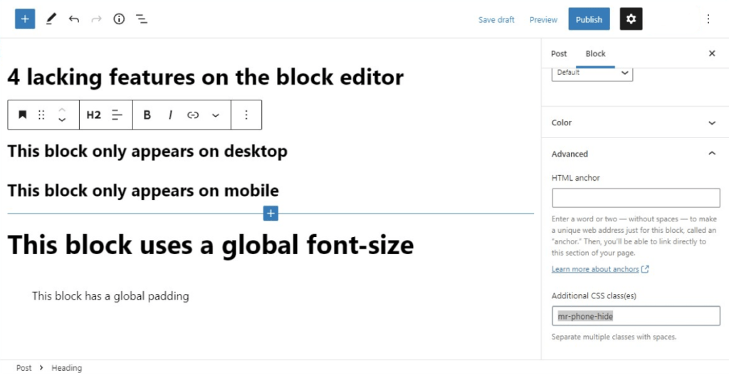
If you didn’t install Mr.Utils as a plugin, most of the methods shown below, will work by adding specific classes into Advanced > Additional CSS Class(es) on any block:
Global font-sizes
With Mr.Utils you have 7 global font-sizes and it’s possible to change their values.
For example, add the class mr-fontsize5 into Advanced > Additional CSS Class(es) on any block that has text and see it changing sizes.
You can also use different sizes depending of the device/breakpoint joining multiple classes, for example:
mr-fontsize5 mr-phone-fontsize4
mr-desktop-fontsize7 mr-tablet-fontsize5 mr-phone-fontsize6
If you want to change the values for the 7 sizes, you can check the documentation explaining how to change variables. It explains how to do it manually or using the Mr.Dev.’s Framework.
Global colors (Mr.Dev.’s Framework)
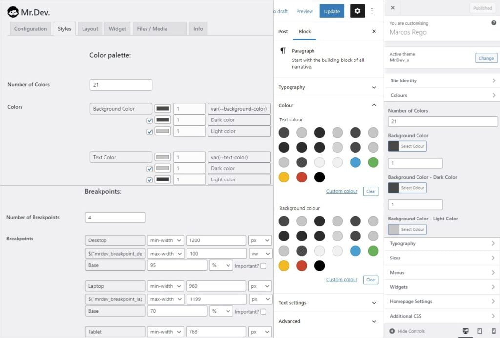
For this one feature, Mr.Utils is currently not enough, you’ll want to use Mr.Dev.’s Framework to define which will be the global colors that appear on the block editor.
Being a global color means that if you select a color and then decide to change the value, all blocks using it will automatically have their colors changed to the new value.
Remove margins and paddings of blocks
Removing margins and paddings can be very useful because currently at the moment of writing, some blocks have default margins or paddings that you might not want. It’s much easier to add a class instead of changing via CSS.
With Mr.Utils you can choose the side you want to remove the margin/padding or remove on all sides. Simply add the correspondent class into Advanced > Additional CSS Class(es):
| mr-nomargin | mr-nopadding |
| mr-nomargintop | mr-nopaddingtop |
| mr-nomarginright | mr-nopaddingright |
| mr-nomarginbottom | mr-nopaddingbottom |
| mr-nomarginleft | mr-nopaddingleft |
And you can also remove the margin/padding only on specific devices/breakpoints, for example:
mr-desktop-nomargin
mr-phone-nopaddingright
Add global margins and paddings
Mr.Utils brings the classes mr-margin and mr-padding, that can also point to specific sides of the block:
| mr-margin | mr-padding |
| mr-margintop | mr-paddingtop |
| mr-marginright | mr-paddingright |
| mr-marginbottom | mr-paddingbottom |
| mr-marginleft | mr-paddingleft |
And you can also use the margin/padding only on specific devices/breakpoints, for example:
mr-desktop-margin
mr-phone-paddingright
If you want to change the values for the global margins and paddings, you can check the documentation explaining how to change variables. It explains how to do it manually or using the Mr.Dev.’s Framework.
Change visibility of a block depending of the device
To show or hide a block, you can use the classes mr-show and mr-hide respectively.
To point to specific devices/breakpoints, all you have to do is to add the device name between the prefix and action. Here are some examples:
| Show on phone only: | mr-hide mr-phone-show |
| Hide on phone: | mr-phone-hide |
| Show on portrait devices: | mr-landscape-hide |
| Hide on desktop and laptop: | mr-desktop-hide mr-laptop-hide |
Change how Columns blocks display on mobile
By default when you set the number of columns on the Columns block, that number will apply on desktop. On mobile the columns will be automatically stacked below each other.
But if you only have images or you don’t have a lot of text in the columns, it could look better with 2 columns on each line.
You can do that with Mr.Utils, you can add classes such as mr-phone-2perline into Advanced > Additional Class(es).
If you installed the toolkit as a plugin it’s even more friendly: Click on “Utilities”, on the phone icon and then on layout you choose 2 as the number of items per line.
Change the order of blocks depending of the device
Changing the order of blocks is easy with drag and drop but if you want to change the order depending of the device/breakpoint, you’ll need something more:
- Select all the blocks that will be reordered and then select the option “Group“.
- On the Group Block go to Advanced > Additional CSS Class(es) and add the class mr-1perline (You can replace 1 with any number between 0 [infinite] and 12, this would be similar to using columns).
- Then select the first block you want to reorder and on Advanced > Additional CSS Class(es) section, add the class mr-breakpoint-order followed by a number between -1 and 12 and replacing breakpoint with the device name (desktop, laptop, tablet, phone or another custom breakpoint that exists). Example: mr-phone-order2. Do the same for each block inside the group (Repeated numbers are allowed).
Horizontal scroll list of posts
Using the block “Latest Posts”, or any other block that works as a list, you can add the class mr-swipecontent or mr-horizontalscrollcontent into Advanced > Additional CSS Class(es), to make that list flow horizontally and become scrollable when the amount of items is big.
Those are the 8 features I wanted to share with you! I’ll update this post If I add more into this front-end toolkit.
